Stark & Wilmer

Case Study 2018
Stark & Wilmer
Branding Design + Logo Design
Brochure
NEEDS
Stark & Wilmer is a law firm celebrating 140 years in the business. Their corporate brochure highlights their rich history and law expertise in the downtown Vancouver area. This project was a design assignment for school where we had to manage the content of a client and create a brand identity.
The primary audience includes prospective clients new to the brand and law firm. The secondary are past and current clients, whom we want to continue to uphold a professional, innovative and contemporary style.
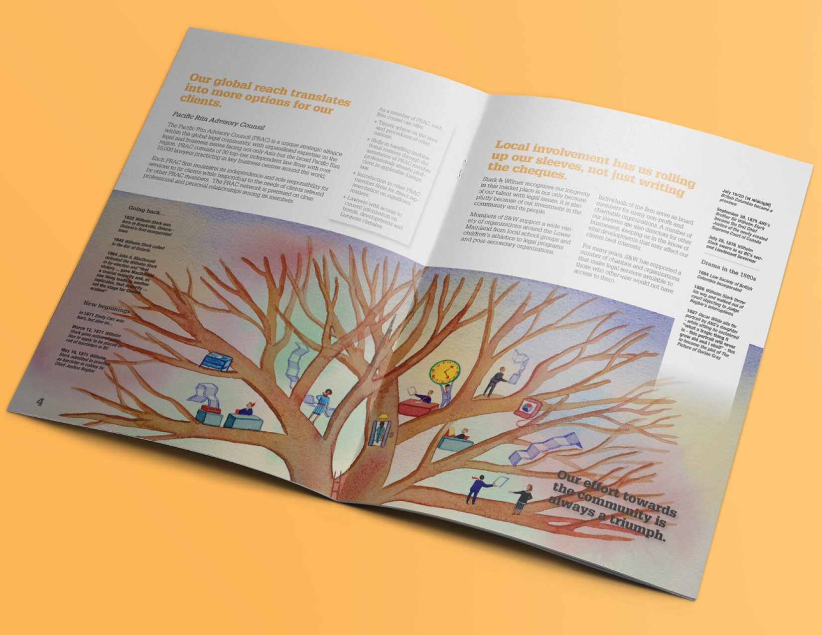
A specific challenge was to incorporate a timeline of information throughout the brochure in a clean and professional layout design.
SOLUTIONS
As time changes, the Stark and Wilmer brand has to balance staying current while preserving trust and practiced experience. The brand development includes modern typography, a variety of illustrations and photographs and overall clean and professional look.
The logo for Stark & Wilmer combines the initials of their names together. The letter S weaves through the W. This was designed to show that the integration of both partnerships has had a significant impact on the company.